Mastering layout with Bootstrap
Bootstrap uses a 12 column grid breakpoints system.
- Extra small
- small
- medium
- large
- extra large
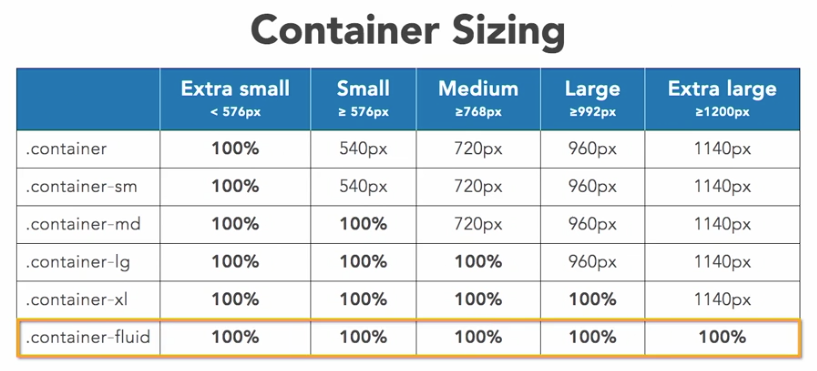
using containers
- responsive 12 column container
- flexbox based
container,row,columnthree classes.container(-SIZ)- SIZ: sm, md, lg,xl,fluid
- They all have each side of 15px padding
- containers have different break point.
Rows/Coloums
- Rows:
- needs the class of
row - more details: `row-cols(-BP)(-COL)
- BP: sm > 576px, md > 768px and so on
- COL: 1-6
- Delete space between use
no-gutters
- needs the class of
- Columns
- up to 12 columns
col(-BP)(-COL)- BP: sm > 576px, md > 768px, etc
- COL: 1-12
- Aligning columns
- Vertical
align-TYP-DIR- TYP: items, self
- DIR: start, center, end
- Don’t forget to add a
VH-100first, means view point 100%.
- Horizontal
justify-content-DIR- DIR: start, center, end, around, between
- Vertical
Offset columns
- offset-BP-COL
- BP: sm > 576px, md > 768px etc
- COL: 1-11
- This is used to adjust the position of the col
Nesting
rowinside column- creates 12-col grid
- use same classes
Customizing Order
order(-BP)-ORD- BP: sm > 576px, md > 768px etc
- ORD: 1-12
- if you gonna change the order of elements, change all of them.
d-flex, flex-column- add these two to the .col will bring adjustability to it’s children elements.
- then you can use .order in child element.
alignment
- vertical alignment
- use in rows
align-item-ALN- ALN: start, center, end
- works on nested cols
- indidual alignment
- use in cols
align-self-ALN- ALN: same as above
- Horizontal Alignment
- use in rows, or horizontal containers
- need col width
justify-content-ALN- ALN: start, center, end, around, between
Position
- Position classes
fixed-topfixed-bottomsticky-topSticky-toplacks support- When using with
<a>to go to a page section with id, it will mess up and block the content. Here’s a working solution in css:
    section[id]:before {
       display: block;
       height: 100px;   /* equal to the header height */
       margin-top: -100px;  /* negative margin equal to the header height */
       visibility: hidden;
       content: "";
       }
- Basic Display
- Minics CSS
d(-BP)-TYP- BP: sm > 576, 768,992,1200 etc
- TYP: none, inline, inline-bock, block, table, table-row, table-cell, flex, inline-flex
- Print Display
d-print-TYP- TYP: none, inline, inline-bock, block, table, table-row, table-cell, flex, inline-flex
- This controls whether the content will be printed to paper
- Basic Flex Container
d(-BP)(-inline)-flex- BP: sm > 576, 768, 992, 1200 etc
options with flex container
- you can add classes to the container, which modifies every items inside of it, or add item level classes to adjust individual items.
- Direction
flex(-BP)(-DIR)(-reverse)- BP: sm > 576 etc
- DIR: row, column
- Order
order(-BP)-ORD- BP: same thing
- ORD: 1-12
- Justify
justify-content(-BP)-ALG- BP: same
- ALG: start, end, center, around, between
- Wrap
flex(-BP)-WRP(-reverse)- BP: same thing
- WRP: wrap, nowrap
- vertical alignment
align-content(-BP)-ALG- BP: same
- ALG: start, end, center, between, around, stretch
Individual Flex Elements
- Align self
align-self(-BP)-ALG- BP: same
- ALG: same 5 things
- Controlling order
order(-BP)-ORD- BP: same break point
- ORD: 1-12
Floating Elements
- Floating Elem
float-(PB)-SID- BP: same ting
- SID: left, right, none
Margin/Padding
PROSID(-BP)-(N)SIZ- PRO: m Margin p padding
- SID: t, r, b, l, x, y
- BP: same deal
- SIZ: 0-5, auto, (in rem, 1: 0.25 rem, 2: 0.5 rem, 3: 1 rem, 4: 1.5 rem, 5: 3 rem)
- N: negitive (n), only works with margin, not padding
- eg.: mt-n5 margin-top set to negative 5; pt-5 padding-top set to 5;
visibility
invisible, visible- when invisible, still occupy the place
d(-BP)-TYP- BP: you know it
- TYP: none, none, inline, inline-bock, block, table, table-row, table-cell, flex, inline-flex;
Sizing
SIZ(-AMT)- SIZ: w, h, mw, mh, vw, vh, min-vw, min-vh
- AMT: 25, 50, 75, 100, auto
Borders
BORDER(-SID)(-COL)(-0)- SID: top, right, bottom, left
- COL: primary, secondary, success, danger, warning, info, light, dark, white
ROUNDED(-SID)(-SHA)(-SIZ)- SID: as above
- SHA: circle, pill
- SIZ: 0, sm, lg