Data Visualization
What is Matplotlib
To make necessary statistical inferences, it becomes necessary to visualize your data and Matplotlib is one such solution for the Python users. It is a very powerful plotting library useful for those working with Python and NumPy. The most used module of Matplotib is Pyplot which provides an interface like MATLAB but instead, it uses Python and it is open source.
General Concepts
A Matplotlib figure can be categorized into several parts as below:
- Figure: It is a whole figure which may contain one or more than one axes (plots). You can think of a Figure as a canvas which contains plots.
- Axes: It is what we generally think of as a plot. A Figure can contain many Axes. It contains two or three (in the case of 3D) Axis objects. Each Axes has a title, an x-label and a y-label.
- Axis: They are the number line like objects and take care of generating the graph limits.
- Artist: Everything which one can see on the figure is an artist like Text objects, Line2D objects, collection objects. Most Artists are tied to Axes.
Getting Started with Pyplot
Pyplot is a module of Matplotlib which provides simple functions to add plot elements like lines, images, text, etc. to the current axes in the current figure.
Make a simple plot
import matplotlib.pyplot as plt
import numpy as np
Here we import Matplotlib’s Pyplot module and Numpy library as most of the data that we will be working with will be in the form of arrays only.
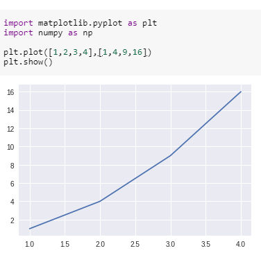
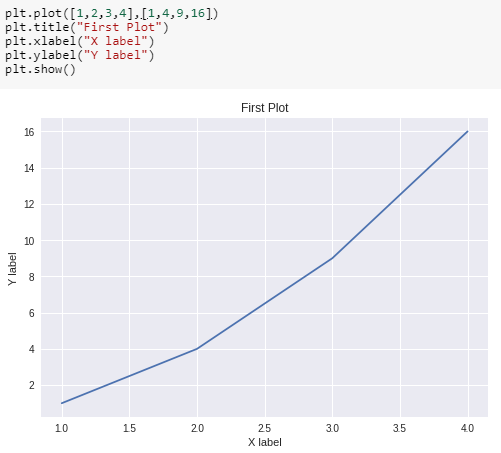
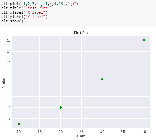
We pass two arrays as our input arguments to Pyplot’s plot() method and use show() method to invoke the required plot. Here note that the first array appears on the x-axis and second array appears on the y-axis of the plot. Now that our first plot is ready, let us add the title, and name x-axis and y-axis using methods title(), xlabel() and ylabel() respectively.
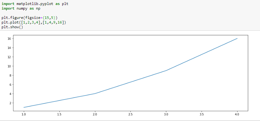
We can also specify the size of the figure using method figure() and passing the values as a tuple of the length of rows and columns to the argument figsize
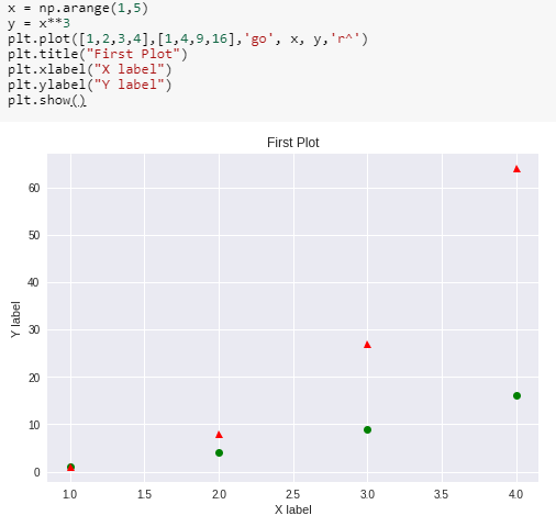
With every X and Y argument, you can also pass an optional third argument in the form of a string which indicates the colour and line type of the plot. The default format is b- which means a solid blue line. In the figure below we use go which means green circles. Likewise, we can make many such combinations to format our plot.
We can also plot multiple sets of data by passing in multiple sets of arguments of X and Y axis in the plot() method as shown.